What is Product Design? To explain Product Design in all its dimensions, we will leverage Don Norman‘s expertise on the topic, especially based on his reference book The Design of Everyday Things.
- Product Design for beginners in a nutshell
- The 7 fundamental principles of design
- Product Design, cognition and emotion, conscious and unconscious behaviors
- Product Design focus and the model of human processing levels
- The 7 Stages of Action in Product Design
- Knowledge in the head vs Knowledge in the world in Product Design
- Types of errors and Product Design: slips and mistakes
- What’s next? Learn more about Product Discovery like Lean Startup, Story Mapping, Impact Mapping and Agile
- Do you want to learn more about Product Design? Here are some valuable references
Don Norman is one of the best reference when it comes to Product Design as he is a worldwide expert in the field of design, usability engineering and cognitive science. To illustrate, he co-created the Nielsen Norman Group and he is a reference member of IDEO and of the Board of Trustees of IIT Institute of Design in Chicago. In addition to his experience as a consultant in Product Design, he is a searcher and a professor.
Product Design is the process of imagining, developing and building iteratively products that solve customers’ problems. Therefore, the key to Product Design is to fully understand the end-user customer. But Product Design is much more than just designing the functionalities and appearance of a Product to deliver value to customers.
Product Design for beginners in a nutshell
There are 3 main aspects in Product Design and they illustrate why Product Design matters and is that important:
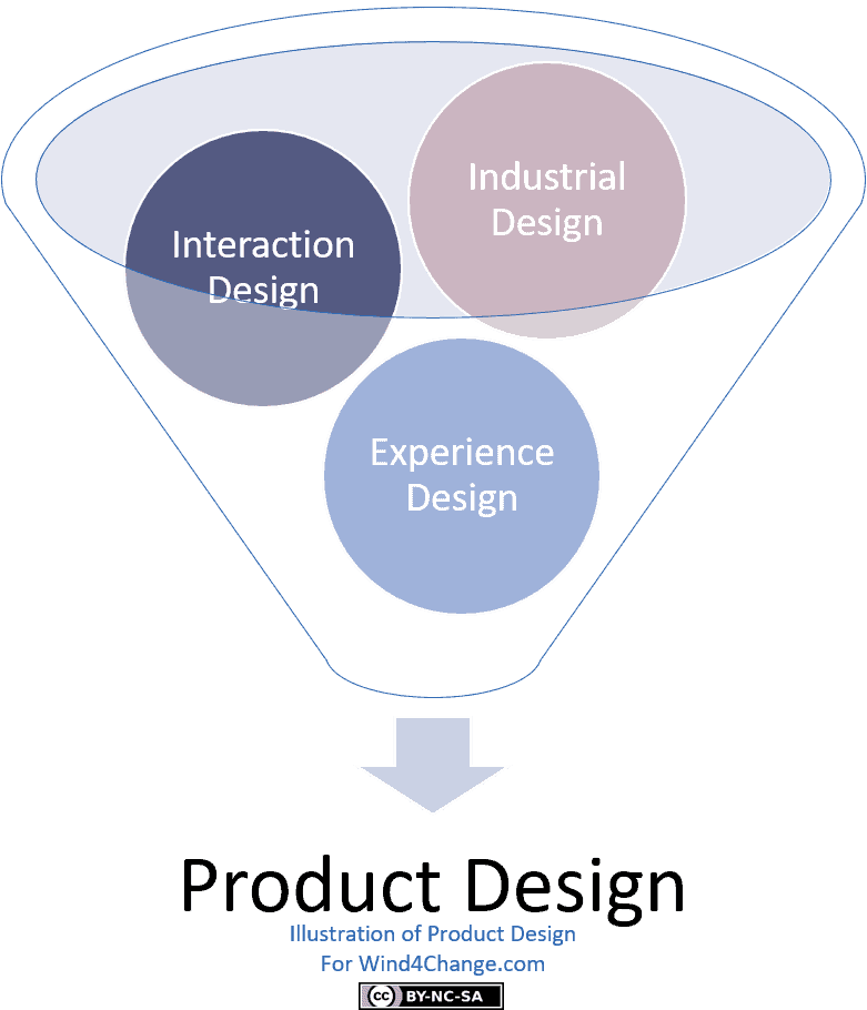
- Industrial design: is the creation and development of the concepts and specifications around functionalities to bring value to customers and the appearance of the product. All this in a way to be beneficial both for customers and the company.
- Interaction design: here the focus is on how customers interact with technology. The goal is to optimize people’s understanding of what can be done and what happens during and after their actions. Clearly, interaction design elaborates on principles of emotion and psychology, with in addition design and art, to create a positive and happy customer’s experience.
- Experience design, supporting User Experience or UX: is not just about the product but is wider as it covers all interactions of the customer with the company, in other words, the customer journey including the environment. In this aspect, emotion and psychology are also in the center to build a positive and happy experience all long the customer journey.
Bad Product Design
Usually bad Product Design results from two reasons.
The first one is that there is no Product Design, even no Product Vison and the input to build the Product is just a list of features. What Don Norman calls Featuritis. To illustrate, main sources of features are:
- New features to match the competition.
- Other features driven by a new technology.
The other reason is that the Design is Technical only and stands for the first aspect of Product Design: the industrial design. So engineers deliver most of the design. They are experts in technology but have a limited understanding of people. As a result, customers have to adapt to the technological aspect of the product. In addition, the typical belief from engineers is that the solution is for the customers to read the documentation. But it is not the good approach. On the contrary, it is at core of Product Design to understand customers and adapt Product and technologies to them.
Human-Centered Design for good Product Design
Human-centered design purpose is to make sure that Product Design properly addresses all customers’ desires, needs, and capabilities. To illustrate:
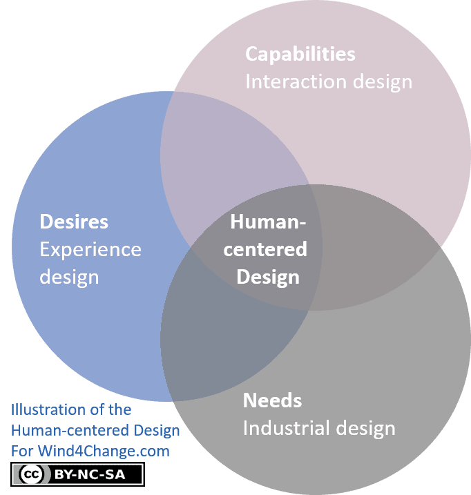
- Industrial design focuses more on customers’ needs.
- Interaction design concentrates on customers’ capabilities.
- Experience design main concern is about customers desires.
The challenge is to understand at the same time technology and people. Actually, the Product Designer should also understand and take into account business viability and production of the product.
At last, Don Norman stresses an important difference between engineers and business people in comparison to Product Designers:
Engineers and businesspeople are trained to solve problems. Designers are trained to discover the real problems.
The 7 fundamental principles of design
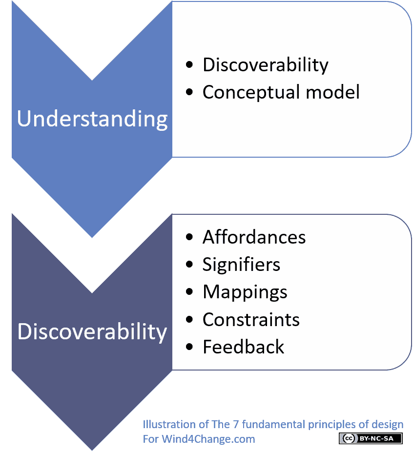
Don Norman develops in his book The Design of Everyday Things, the 7 principles of Product Design. There are two areas:
- Understanding: the meaning of the product with how to use the product and how to manage the product’s controls and settings to do so.
- Discoverability: how easy it is to figure out what actions are possible with the Product and where, when and how to perform them.
Principles of the understanding area from the 7 fundamental principles of design
Discoverability
The principle of Discoverability stands as the overall discoverability of the product and is in the understanding area. Surely it is a little bit confusing as it is the same name as the Discoverability area where all the specific principles of Discoverability are. This principle is about determining what actions are possible with the product but also the current state of the device. Truly, we need to explain this last one further: in what mode the product is in? For instance, for a clock, is it displaying the time or is it in setting mode to adjust the time? Indeed, different actions are possible depending on the state. In addition, are we in the middle of a transaction? Or our transaction is completed, validated and the Product is in a stable state without any pending transaction?
Conceptual model
Conceptual model is the second principle of the Understanding area. A conceptual model is an explanation, typically highly simplified, of how the product works. Furthermore, a conceptual model provides understanding on how the product behaves based on our actions and what to do when things do not go as expected.
To illustrate, the files, folders, and icons in computers create the conceptual model of documents and folders inside the computer. So customers know what to do as they replicate what they would do with physical files and folders. Surely, a conceptual model does not need to be complete or totally accurate as far as it is useful. Actually, the voluntary simplification makes it more useful as it makes it easier to understand what matters without the noise of the details.
We form conceptual models through our experience and training. As a result, we manage to understand the world and achieve our goals using these conceptual models as guides.
To sum up, a good conceptual model makes it possible for the customer to understand and feel in control of the Product. Furthermore, the good conceptual model enhances at the same time the discoverability of the Product and the evaluation of the results of actions.
Principles of the discoverability area from the 7 fundamental principles of design
Affordances
Don Norman defines an affordance as a relationship between the properties of a product and the capabilities of the user to determine how the product could be used. Truly, affordance is not a property, it is a relationship.
For example, knobs of doors afford turning, pushing, and pulling, depending on their design. Another illustration are slots: a user would guess that it is to insert something into.
At last, when the user cannot perceive an affordance, there is a need to signal its presence. Don Norman calls that a signifier.
Signifiers
Signifiers point out what actions the user can do and how he or she can do them. Clearly, signifiers must be perceivable to the user. If not they fail their purpose and only imagination remains for the user to find how to proceed to achieve his or her objective. To illustrate, signifiers may be marks, sounds, or any other clue that indicates the appropriate behavior to the user.
To sum up, effective signifiers ensure the discoverability of the product and that the user gets a clear feedback.
Mappings
Mapping is a technical term coming from mathematics that is a relationship between the elements of two sets of things. Surely, a natural mapping enables an immediate understanding. For instance a spatial mapping or a temporal contiguity. In other words, a spatial mapping is a spatial correspondence between the layout of the controls and the devices being controlled.
As a result, a natural mapping needs no additional diagram, label, or instruction. For example, to move an object up, move the control up or arrange the controls for a large room in the same pattern as the lights.
Types of mapping starting from the more intuitive:
- Firstly, controls are integrated on the item they control.
- Secondly, controls are close to the object they control.
- Thirdly, controls are arranged in the same spatial configuration as the objects they control.
Constraints
Constraints provides guides and clue interpretations through physical, logical, semantic and cultural constraints.
Physical constraints
The design of the product may limit and constrain the possible operations. Physical constraints are all the more effective that the user can see and interpret them easily, so his or her actions are restricted before doing them. Otherwise, the physical constraint prevents a wrong action only after trying. But this may lead to frustration and loss of efficiency.
Forcing function as a form of physical constraint
A forcing function is when an action is constrained and requires the previous one(s) to be successful before going to the next step.
The types of forcing functions are:
- Interlocks that force operations to take place in defined sequence. For instance, devices that cannot be opened while in activity to prevent hazards like microwave ovens.
- Lock-ins that keep an operation active and prevent the user to stop it before completion. To illustrate, you have many lock-ins on computer applications, with warning messages if you exit the application without saving work.
- Lock-outs on the contrary prevent people from getting into a space that is dangerous or prevent an event from occurring. Typical example is the pin on fire extinguishers to prevent someone from accidental activate them.
Logical constraints
Here this is the logic that is the constraint. For instance, there is a logical relationship between controls and what they do. Actually, this relates to mapping.
Semantic constraints
Semantics is the study of meaning. So semantic constraints use the meaning of the situation to determine the set of possible actions.
Cultural constraints
Each culture has a set of acceptable actions depending on social situations. Don Norman refers to a specific aspect of cultural constraint: conventions.
Conventions determine what to do and discourage, even sometimes prohibit, what not to do. Actually, conventions may even be codified into international standards. Clearly, standards simplify life for everyone. But at the same time, they make it difficult to change.
Feedback
Users need feedback when using a product about what their actions are going to do, how they are going when in process, their results and the current state of the product especially after actions. Really, users need feedback all the more so when an action goes wrong.
Don Norman highlights some good practices with feedback in Product Design:
- Feedback must be immediate: even a delay of couple seconds can be disconcerting.
- Then, feedback must be informative. Basic lights or sound generators are cheap but may not be enough informative and may generate misunderstanding and frustration.
- Level of feedback must be balanced as too many announcements cause people to ignore them, or even, disable them totally but they will also miss critical ones.
- Feedback must be prioritized to present low criticality information a discreet way and critical information a way that does capture attention.
Product Design, cognition and emotion, conscious and unconscious behaviors
Cognition and emotion tightly interlace in human being. As a result, Product Design must take both of them into account. For instance, we make sense of the world with cognition and assign value to choices with emotion.
In addition, human behaviors are a mix of conscious and most often subconscious behaviors. What Daniel Kahneman calls System 1 and System 2 in his book Thinking, Fast and Slow:
- System 1 is the subconscious level. This cognitive level is good at finding trends and generalizing based on our experience. It is fast and requires low cognitive energy. But is is biased toward regularity and is likely to miss uncommon events or parameters. In addition, there are cognitive biases in subconscious level, like the tendency to overweight risk or what is near in the future.
- On the contrary, System 2 is the conscious level. It is slow and cognitive energy consuming. This cognitive level is good at dealing with complex and unusual problems. Indeed, in conscious level, we rationalize, find explanation, identify relevant parameters and compare options. To illustrate, the tools of conscious thinking are: logic, decision theory, mathematics and sciences.
Another interesting way to see the levels of cognition and emotion within human being is through the processing levels that we develop below.
Human processing levels: Visceral, Behavioral and Reflective levels
Visceral processing level
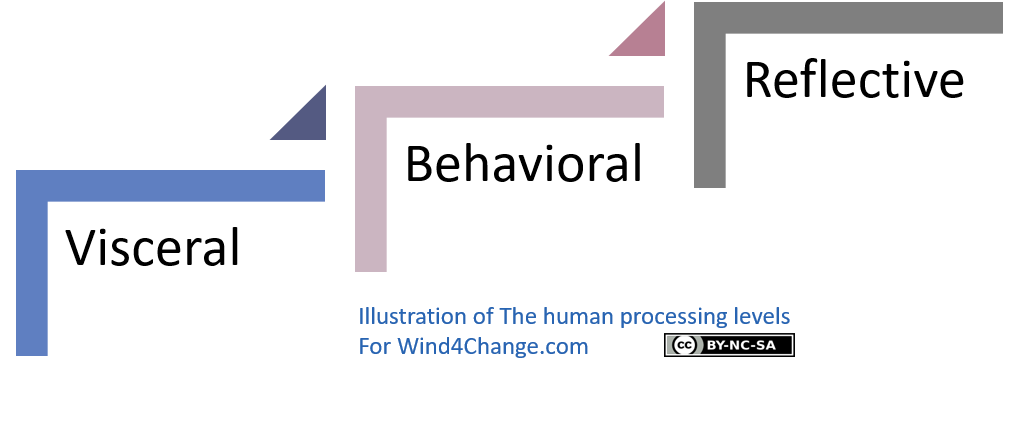
The visceral processing level is what science calls the “lizard brain“. In fact, they are not even considered as emotions, but as precursors to emotions. In other words, those are all the basic protective mechanisms to make a quick and basic evaluation about our environment: safe or dangerous, good or bad. All human beings have the same basic visceral responses. They are biological and subconscious, so there are limited possibilities to learn in this processing level.
In terms of Product Design, the visceral processing only catches about instant perception based on sound or sight, touch or smell: is it pleasant or on the contrary irritating? Truly here, it is not about how usable, effective, or understandable the product is. It is about attraction or repulsion.
Behavioral processing level
The behavioral processing level are learned skills that we activate in relevant situations. Actually, we just have to think about the objective, but after that, the delivery of analyses and actions is largely subconscious. For instance, when we play a sport, we practice to learn what to do, but when playing, all is going fast and unconsciously with the behavioral processing level.
Regarding Product Design, this means that in behavioral processing level each action expect either a positive or negative outcome. And as a result, a positive or a negative affective response. In addition, feedback from the product, confirms or disconfirms the expectations, with as a result satisfaction or relief, disappointment or frustration.
Good Product Design provides a feeling of control when the user understands how to proceed and the result of actions in the product. On the contrary, bad Product Design generates misunderstanding as the product does not react as expected without reason or remedy. Then, the result for the user is frustration and anger. At last, feedback provides reassurance, even when its is about a negative result. On the other hand, a lack of feedback results in a feeling of lack of control.
Reflective processing level
The reflective processing level is the conscious cognition with reasoning and conscious decision-making. In other words, this is where we identify causes and predict the results of our actions. Strong emotions happens in this highest level of processing: guilt and pride when we assume that we are the cause of the result, and blame and praise when we think that the cause of the result is coming from the others.
Product Design focus and the model of human processing levels
All levels are important but the Product Design focuses on two main levels of processing: the behavioral and the reflective levels where are the most powerful emotions.
Behavioral processing level
Indeed, the behavioral processing level is where interaction between the user and the product happens. To put it differently, it is where expectation-based emotions emerge: joy or, frustration and anger.
Reflective processing level
Beside that reflective processing level, is where memories of events generate. Really, memories last far longer than the immediate experience where users are in the visceral and behavioral processing levels. As a result, it is what we experience in the reflection processing level that drives us to recommend a product or on the contrary to avoid it. In fact, memories may transform what we remember of the actual experience. For instance, the reflective level may overpass a disappointing usability experience that is at the behavioral processing level, if we had a strongly positive visceral experience.
Attractive things work better.
To sum up, in Product Design the reflection processing level is probably the most important level of processing.
The 7 Stages of Action in Product Design
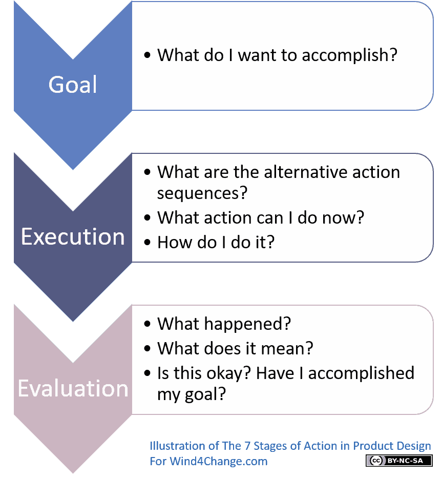
In addition to understand where and how thinking and emotions emerge, it is important in Product Design to understand the process the user goes through to perform an action. Don Norman developed the model of the 7 Stages of Action to do so.
One of the key challenge in Product Design is to bridge the gap between what Don Norman calls the gulf of execution and the gulf of evaluation:
- Firstly, the Gulf of Execution is where users try to figure out how to operate the product.
- Secondly, the Gulf of Evaluation is where users try to find out what happened with the product.
And the 7 Stages of Action structures over these two phases of action. There is in addition a start step about the goal:
Goal
1) What do I want to accomplish?
Execution
2) What are the alternative action sequences?
3) What action can I do now?
4) How do I do it?
Evaluation
5) What happened?
6) What does it mean?
7) Is this okay? Have I accomplished my goal?
So if we map the level of processing to the 7 Stages of Action, we get:
- The visceral response is at the lowest level and supports all activities where there is an interaction with the product. Surely, it is just about controlling our muscles and sensing the state of the world and body.
- Then, the behavioral level is about automatic actions, if we have learned them, and expectations. So it covers the execution and the evaluation with the expectations of the action sequence, then the interpretation of the feedback.
- At last, the reflective level is a part of the goal and plan setting activity, then it covers the comparison of expectations with what has actually happened.
Knowledge in the head vs Knowledge in the world in Product Design
Definition of Knowledge in the head vs Knowledge in the world in Product Design
Don Norman explains that human knowledge is not just in the head but that it can be deployed in the world. So he defines two types of knowledge and connects them to the 7 principles of Product Design.
- Knowledge in the head includes:
- Conceptual models.
- Product constraints on behavior and analogies with previous experiences or situations. In other words, the users did not voluntarily learn this knowledge in the head to use the product.
- Knowledge in the world includes:
- Affordances and signifiers.
- The mappings between controls to manipulate the product and the resulting actions.
- The physical constraints that limit what can be done.
Balancing smartly Knowledge in the head and Knowledge in the world
Knowledge in the head is efficient as there is no need for search and interpretation. But to use our knowledge in the head, we have to learn then remember it. Surely, this requires a significant time and effort for learning.
On the contrary, knowledge in the world requires no learning. But it needs a good Product Design. Furthermore, knowledge in the world acts as a reminder. Indeed, it helps us to remember how to proceed as human mind works with connections. So the product integrates clues that act as reminders. Yet knowledge in the world works only if it is available at the right place and at the right time.
Principles of Knowledge in the head and Knowledge in the world for Product Design
Don Norman comes with 4 principles to properly balance between Knowledge in the head and Knowledge in the world:
- Product Design should use both knowledge in the head and in the world. Just enough knowledge in the head, maximizing the pre-existing knowledge, then using as much as possible knowledge in the world.
- Underlying conceptual model supporting knowledge in the world do not need to be precise and accurate as long as they are intelligible and useful to make sense on how to use the product.
- Leverage the natural constraints existing in the world like how parts go together and move, in order to restrict possible behaviors. Really, constraints simplify need for learning and remembering.
- At last, knowledge from cultural constraints and conventions can be useful to reduce the possible actions.
Types of errors and Product Design: slips and mistakes
Overview of slips and mistakes
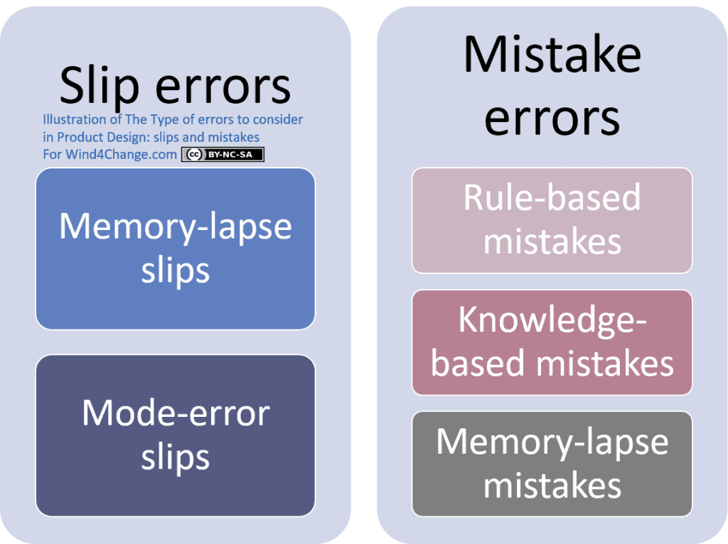
- Slip errors:
- A slip happens when a user intends to do one action and ends up doing something else. In other words, the action performed is not the one that was intended.
- Mistake errors:
- A mistake happens when the user targets a wrong goal or when he or she selects the wrong plan to achieve a correct goal.
Slip errors
Memory-lapse slips
- The direct cause of most memory-lapse slip is interruption. To put it differently, events happening between the time the user decides to perform an action and the time he or she completes it.
- Consequences of memory-lapse slip fall into:
- Missing one or several steps.
- Repeating one or several steps.
- Forgetting about the goal or the outcome of the action.
- Mitigations to take into account in Product Design are:
- Minimize the number of steps.
- Provide live reminders of completed steps.
- Use a forcing function and make one step only possible if the user has completed the previous. For instance, automated teller machines require the user to remove the bank card before getting the money.
Mode-error slips
- A mode is a different state for a given product.
- Then, a mode error happens when a product has different states where the same controls have different use depending on the mode. For example, alarm clocks typically use the same controls and display for setting the time of day and the time of the alarm.
- Clearly, mode error is a design error. Furthermore, mode errors happen all the more so that the product poorly makes the mode visible. So the user forgets, after some time, the mode the product is in, and performs the wrong action.
- Mitigations to take into account in Product Design are:
- Avoid modes, but if they are necessary, make sure that the product clearly displays the mode it is in.
- Then avoid procedures that have identical opening steps but then diverge.
- At last, ensure that controls and displays for different purposes look significantly different from each other.
Mistake errors
Rule-based mistakes
- Rule-based mistakes happen when the user fails to identify the correct situation or fails to select the proper rule and procedure to follow.
- Mitigation is to present the information about the state of the product in a way that is easy to assimilate and interpret.
Knowledge-based mistakes
- Knowledge-based mistakes occur when the situation is new enough that no skill or rule covers it. So here, applying a procedure is not the answer and the user needs to use the reflective level. He or she needs to analyze the situation. Then based on his or her past experience, intelligence and creativity, he or she has to find the best solution.
- Mitigation is to support user’s understanding of the situation, usually with relevant information and a relevant conceptual model.
Memory-lapse mistakes
- Memory lapses mistakes happen when a memory failure leads to forgetting the goal or the plan of action.
- The mitigation for memory-lapse mistakes is the same as for memory-lapse slips: make sure that all the relevant information is continuously available.
Product Design to prevent errors
Bad Product Design generates errors
Products are the source of errors because of their poor design when they:
- Need users to stay fully attentive during hours.
- Require users to remember complex procedures without meaning.
- Expect users to wait without nothing todo for a while then suddenly quickly and accurately proceed to manage events.
- Subject users to high-workload environments with frequent interruptions and multi-tasking.
Moreover, when errors occur, all investigations stop when a human error is found. And the typical answer from the management is to send people to training!
Errorproof Product Design
Making errors is in human nature especially in unnatural contexts as described above.
Don Norman proposes the following approach to design an errorproof product:
- Understand the causes of error and design to minimize them.
- Pass the design under a “common sense” test. This will support an intuitive and natural design.
- Enable users to reverse actions or add additional securities for actions that the user cannot reverse.
- Make it easier for users to discover errors when they happen so they can fix them.
- Whenever possible manage errors as uncomplete actions to reduce frustration.
What’s next? Learn more about Product Discovery like Lean Startup, Story Mapping, Impact Mapping and Agile
- To learn more about other frameworks supporting Product Development like Lean Startup, Story Mapping and Impact Mapping check my other post.
- In addition, you can review my posts introducing Agile and Agile at Scale.
- At last, learn more about innovation with all my posts about Digital and the disruptive technologies.
Do you want to learn more about Product Design? Here are some valuable references
- The book from Don Norman, The Design of Everyday Things.
- A presentation of Don Norman.
- Some posts about Product Design from:
